
Data is the backbone of modern decision-making, but raw numbers alone can’t drive action. Power BI has revolutionized the way organizations analyze and present data. For new Power BI data analysts, understanding the various visualization charts is crucial for transforming raw data into actionable insights. At the heart of this transformation lies Power BI visualization charts. Understanding data is one thing, but communicating its meaning to others is a critical skill. Power BI empowers you to do just that, turning complex datasets into clear, digestible visual stories. It’s not just about making pretty charts; it’s about crafting compelling data narratives that drive decisions. This guide serves as an essential introduction to Power BI visualization charts and their role in effective data storytelling. Let’s dive in!
Why Visualization is Your Superpower in Power BI
Data analytics without visualization is like navigating a maze blindfolded. You might eventually find the exit, but the process will be slow, frustrating, and prone to error. Visualization transforms raw data into intuitive insights—here’s why it’s non-negotiable in analytics: Before we explore specific visualization chart types, let’s understand why visualizations are paramount in Power BI and data analysis:
- Clarity from Complexity: Humans are visual creatures. We process visual information significantly faster than text or raw numbers. Visualizations transform rows and columns of data into patterns and trends that are instantly recognizable.
- Enhanced Understanding: A well-chosen visual can illuminate relationships, outliers, and distributions that might be hidden in a spreadsheet.
- Improved Decision-Making: Clear insights lead to confident decisions. When stakeholders can easily grasp the implications of data, they are better equipped to act.
- Increased Engagement: A visually appealing dashboard is far more engaging than a static report. Interactive Power BI visuals invite exploration and discovery.
- Effective Storytelling: Every dataset has a story. Visualizations are your tools to narrate that story, guiding your audience through the key findings and highlighting what truly matters. As a new Power BI analyst, mastering this skill will set you apart.
Essential Power BI Visualization Charts Every Analyst Should Know
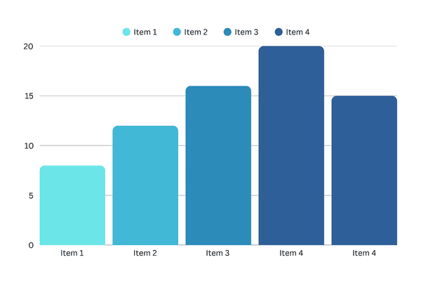
1. Bar and Column Charts
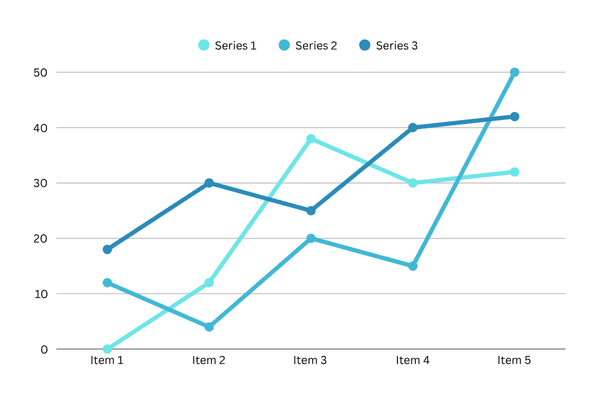
Line charts are ideal for tracking changes across a timeline, helping users see whether values are increasing, decreasing, or remaining consistent.
- Purpose: Compare values across categories (e.g., sales by region).
- Pro Tip: Avoid overcrowding—limit to 5-7 categories for clarity.
- Best For: Showing trends over time with Horizontal (bar) or vertical (column) comparisons.
Power BI Tips:
- Use column charts when the order of categories is important (e.g., time periods).
- Use bar charts when category names are long for better readability.
- Stacked bar/column charts can show parts of a whole within each category.
- Clustered bar/column charts allow direct comparison of sub-categories.
Example Use Case: Monthly website traffic, annual revenue trends
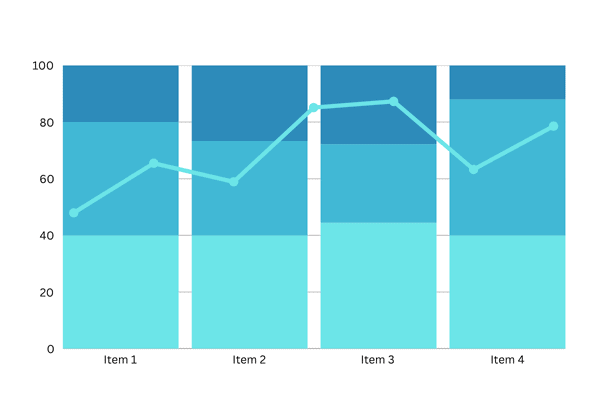
2. Line and Area Charts
Line charts are ideal for tracking changes across a timeline, helping users see whether values are increasing, decreasing, or remaining consistent.
- Purpose: Track trends over time (e.g., monthly revenue growth).
- Line Charts: Highlight individual data points.
- Area Charts: Emphasize cumulative totals with shaded regions.
- Pro Tip: Use dual-axis line charts to compare metrics with different scales.
- Best for: Showing trends over time.
Power BI Tips:
- Multiple lines can compare trends for different series.
- Be cautious with too many lines; it can become cluttered.
- Area charts (line charts with the area below the line filled) can emphasize volume or magnitude of change.
Example Use Case: Monthly website traffic, annual revenue trends
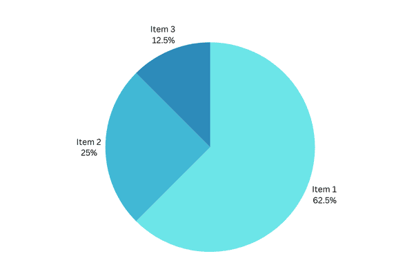
3. Pie and Doughnut Charts
These visuals are great for emphasizing how a segment compares to the total. However, they should be used sparingly and only when there are limited categories.
- Purpose: Show parts of a whole (e.g., market share distribution).
- Doughnut Charts: Add a central label for totals or KPIs.
- Limitation: Avoid using negative categories—opt for bar charts instead.
- Best for: Showing proportions of a whole.
Power BI Tips:
- Best used with a small number of categories (ideally 5 or fewer). Too many slices make them hard to read.
- Ensure the segments sum up to 100%.
- Bar charts are often a better alternative if you have many categories or want precise comparison.
Example Use Case: Market share distribution, departmental budget allocation
4. Combo Charts
- Purpose: Merge column and line charts to compare trends (e.g., sales vs. profit margins).
- Best For:
- Highlighting correlations between two metrics.
- When you have a line chart and a column chart with the same X-axis.
- To compare multiple measures with different value ranges.
- To illustrate the correlation between two measures in one visual.
- To check whether one measure meets the target, which is defined by another measure.
- To conserve canvas space.
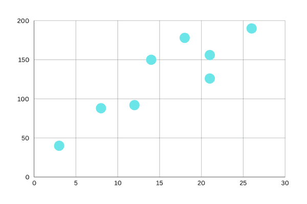
5. Scatter and Bubble Charts
Scatter plots help identify relationships between two numerical values and are great for identifying outliers.
- Purpose: Identify relationships between variables (e.g., marketing spend vs. conversions).
- Bubble Charts: Add a third dimension with bubble size.
- Best for: Analyzing correlations.
Power BI Tips:
- You can add a third numerical variable to control the size of the data points (making it a bubble chart).
- Trend lines can be added to highlight correlations.
Example Use Case: Advertising spend vs. sales revenue
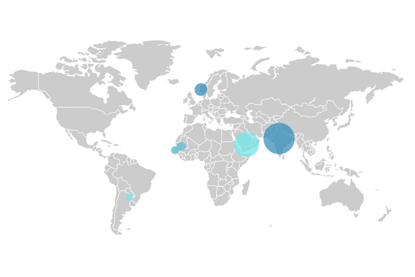
6. Maps
Map visuals are powerful when working with location-based data. They bring spatial patterns to light.
- Regional Maps: Color-code geographic data (e.g., sales by country).
- Point Maps: Plot precise locations (e.g., store performance).
- Best for: Geographic data visualization.
Power BI Tips:
- Ensure your location data is clean and unambiguous.
- Bubble maps (using size of bubbles on a map) can represent magnitude.
Example Use Case: Store locations, sales by country or region
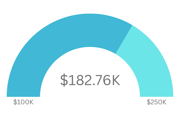
7. Gauge Charts
A radial gauge chart has a circular arc and displays a single value that measures progress toward a goal. The goal, or target value, is represented by the line (needle).
- Purpose: Track progress toward goals (e.g., quarterly sales targets).
- Best For:
- Single KPIs with clear benchmarks.
- Show progress toward a goal.
- Represent a percentile measure, like a KPI.
- Show the health of a single measure.
- Display information that can be quickly scanned and understood.
Example Use Case: Progress toward that goal is represented by the shading
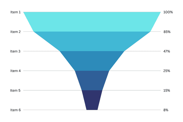
8. Funnel Charts
Funnels help visualize a process that has stages, and items flow sequentially from one stage to the next. One example is a sales process that starts with leads and ends with purchase fulfillment.
- Purpose: Visualize process stages (e.g., lead conversion rates).
- Best For: Identify bottlenecks in workflows.
Example Use Case: A sales funnel that tracks customers through stages: Lead > Qualified Lead > Prospect > Contract > Close. At a glance, the shape of the funnel conveys the health of the process you’re tracking. Each funnel stage represents a percentage of the total. So, in most cases, a funnel chart is shaped like a funnel — with the first stage being the largest, and each subsequent stage smaller than its predecessor. A pear-shaped funnel is also useful — it can identify a problem in the process. But typically, the first stage, the “intake” stage, is the largest.
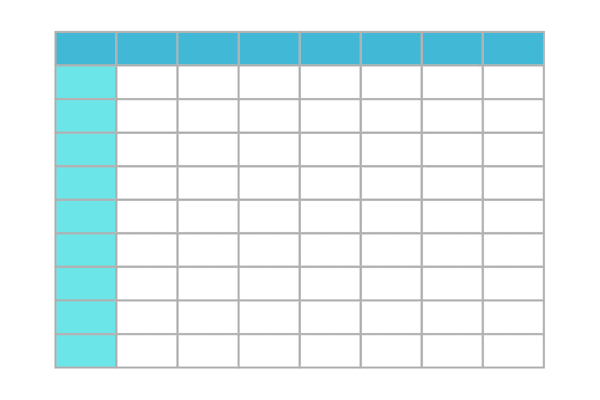
9. Matrix and Tables
The matrix visual is a type of table visual (see Tables in this article) that supports a stepped layout. A table supports two dimensions, but a matrix makes it easier to display data meaningfully across multiple dimensions.
- Matrix: Hierarchical data with drill-down capabilities.
- Tables: Detailed comparisons (e.g., product performance metrics).
Power BI Tips:
- Use conditional formatting to highlight key values or trends within the table/matrix.
- Keep tables concise; too much data can be overwhelming.
Example Use Case: Report designers include matrixes in reports and dashboards to allow users to select one or more elements (rows, columns, cells) in the matrix to cross-highlight other visuals on a report page.
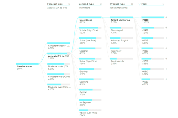
10. Decomposition Trees
The decomposition tree visual lets you visualize data across multiple dimensions. It automatically aggregates data and enables drilling down into your dimensions in any order.
- Purpose: AI-driven root cause analysis (e.g., revenue decline factors).
- Best For: Ad-hoc exploration of multi-dimensional data.
Example Use Case: It is also an artificial intelligence (AI) visualization, so you can ask it to find the next dimension to drill down into based on certain criteria. This capability makes it a valuable tool for ad hoc exploration and conducting root cause analysis.
Best Practices for Power BI Visualizations
Creating impactful dashboards involves more than choosing the right charts. Follow these tips to improve your visual storytelling:
- Use Clear Titles and Labels – Avoid ambiguity by labeling visuals clearly. Use titles that tell viewers what the chart is about.
- Keep It Simple – Don’t overcrowd your dashboard. Focus on the visuals that directly support your story.
- Choose the Right Visual for the Data – Different visuals serve different purposes. Match the visualization type to your analytical goal.
- Use Color Wisely – Use consistent and meaningful colors to highlight key data points without overwhelming the viewer.
- Enable Interactivity – Use slicers, tooltips, and drill-throughs to allow users to explore the data more deeply.
Common Mistakes to Avoid
- Using Too Many Visuals on One Page – Cluttering your dashboard with too many visuals can overwhelm users and dilute your message. Focus on the most impactful charts and arrange them with plenty of white space for a cleaner, more professional appearance.
- Relying Heavily on Pie Charts with Too Many Slices – Pie charts are effective in small doses, but when there are too many slices, they become difficult to read and compare. Use bar or column charts instead for clearer comparisons when dealing with multiple categories.
- Ignoring Accessibility and Readability – Ensure that your dashboards are accessible to all users, including those with visual impairments. Use readable font sizes, high-contrast colors, and alternative text for visuals when appropriate.
- Failing to Consider Mobile View Optimization – Many users access reports on mobile devices. Design your dashboards with responsive layouts and simplified visuals to ensure a seamless experience across all screen sizes.
Final Thoughts: Data Storytelling Starts with the Right Visuals
For aspiring Power BI data analysts, learning to select and implement the right visualization charts is a foundational skill. Visuals help bring data to life, allowing decision-makers to grasp complex insights quickly. By mastering the use of Power BI charts and dashboards, you can drive impactful business decisions and elevate your analytical storytelling.

Victor Hugo Solis
Master’s Degree in Information Security, a Bachelor’s Degree in Database Administration, and experience as a WordPress Web Designer & Developer.